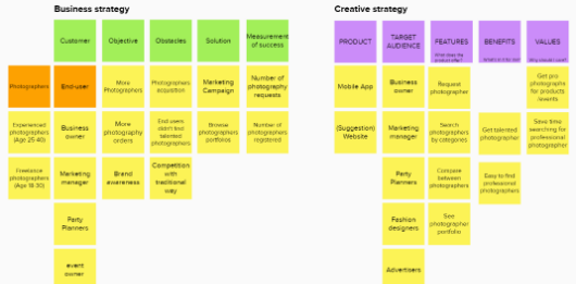
As always we start any project with stakeholders interviewing, in which we understand many of the business and brand aspects that we need in order to define together the business objectives, KPI’s and targeted customers.
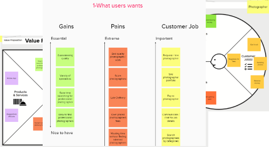
We used the value proposition canvas to deeply understand the value our product offers, and raise questions to be validated further with the users.
By considering the competition at the very beginning of the project, we determine the strengths and weaknesses of the competition in the market, and helps finding a distinct advantage.
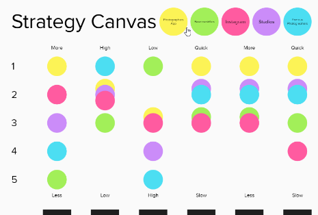
We got a better understanding of the business, target users, we got assumptions, questions and we need validation and answers !
This is where the User research comes in handy !
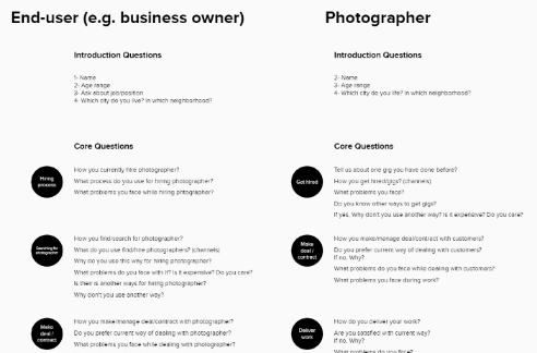
We’ve been through interviews with a bunch of kuwaiti users from more both user roles sides (Photographers / end-users) then we get back to office and start analyzing these recordings to better understand the user needs and priorities.
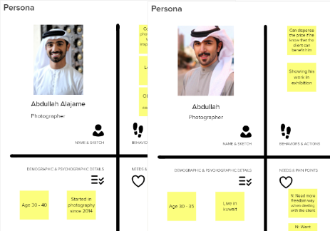
Personas helps us model the users personalities, behaviors, pains & needed gains, which helps us better ideate the right features and set it’s priorities later on.
While personas are great, empathy takes user modeling to another level, getting us deeper into what the users really thinks, what they feel and how they feel or think in a deeper emotional level.
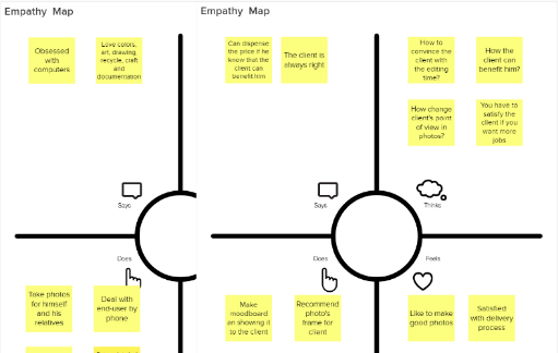
Now we understand our users deeply, we are driven by empathy, it’s time to find solutions that fit their needs.
It’s time to convert the information collected into Usable, Valuable, Desirable product.
We started our information architecture after having some refined features in hand, now we want to organize these information in a clear and logical way, and since time is the most precious resource people have, we aimed at making the information easy to find with the least amount of effort, resulting in user-friendly, usable product.
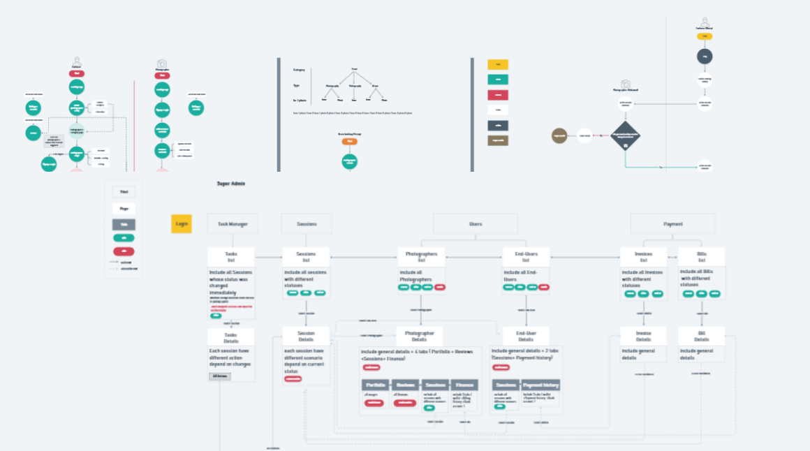
Wireframes give us the ability to test our thoughts and brainstorm our ideas ,translate them into usable interfaces that solve people’s problems and satisfy their needs.

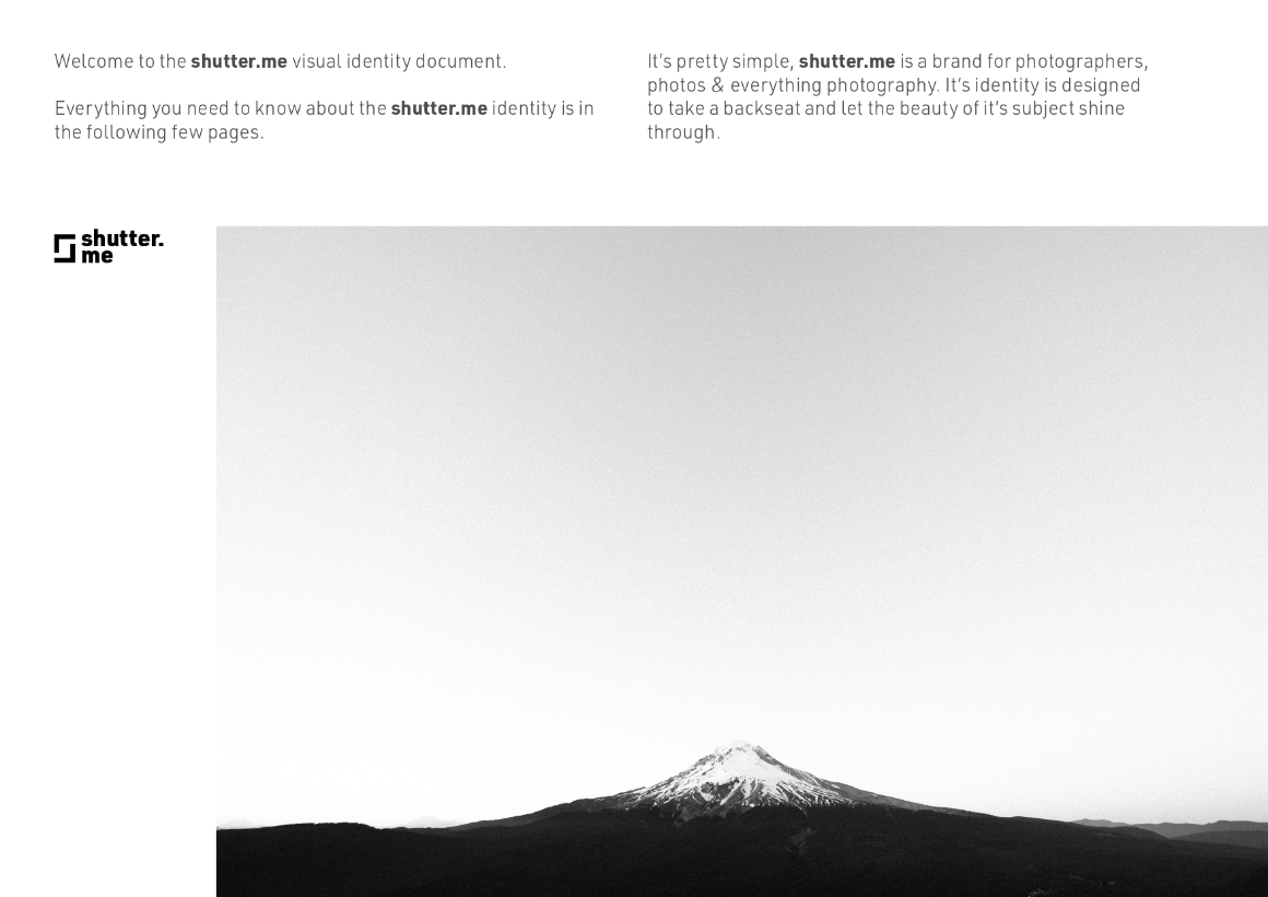
Since branding not only makes memorable impression on consumers, but it allows customers to know what to expect from the company, it had to be present before jumping to the UI.
We started branding in parallel with wireframes to get them ready when starting working on UI, the branding matches the research we made, reflects the feel of the product.
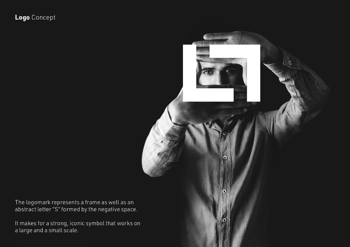
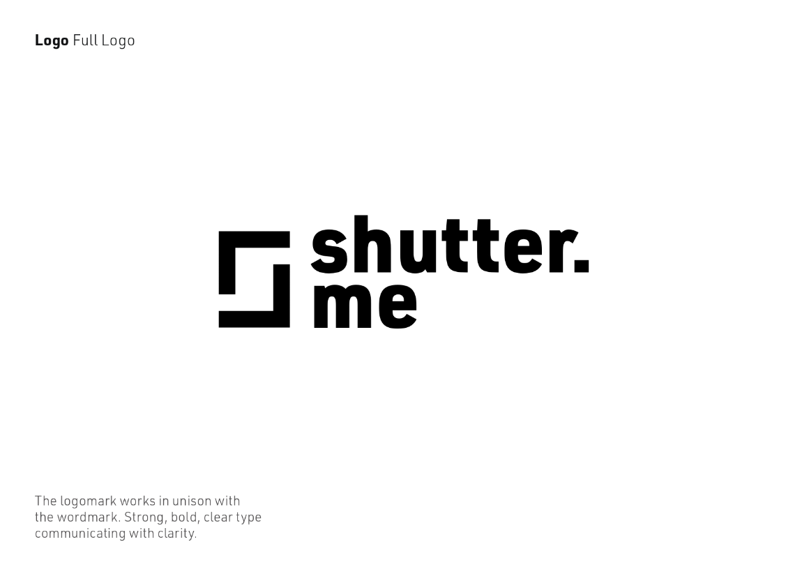
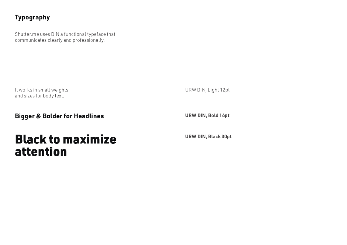
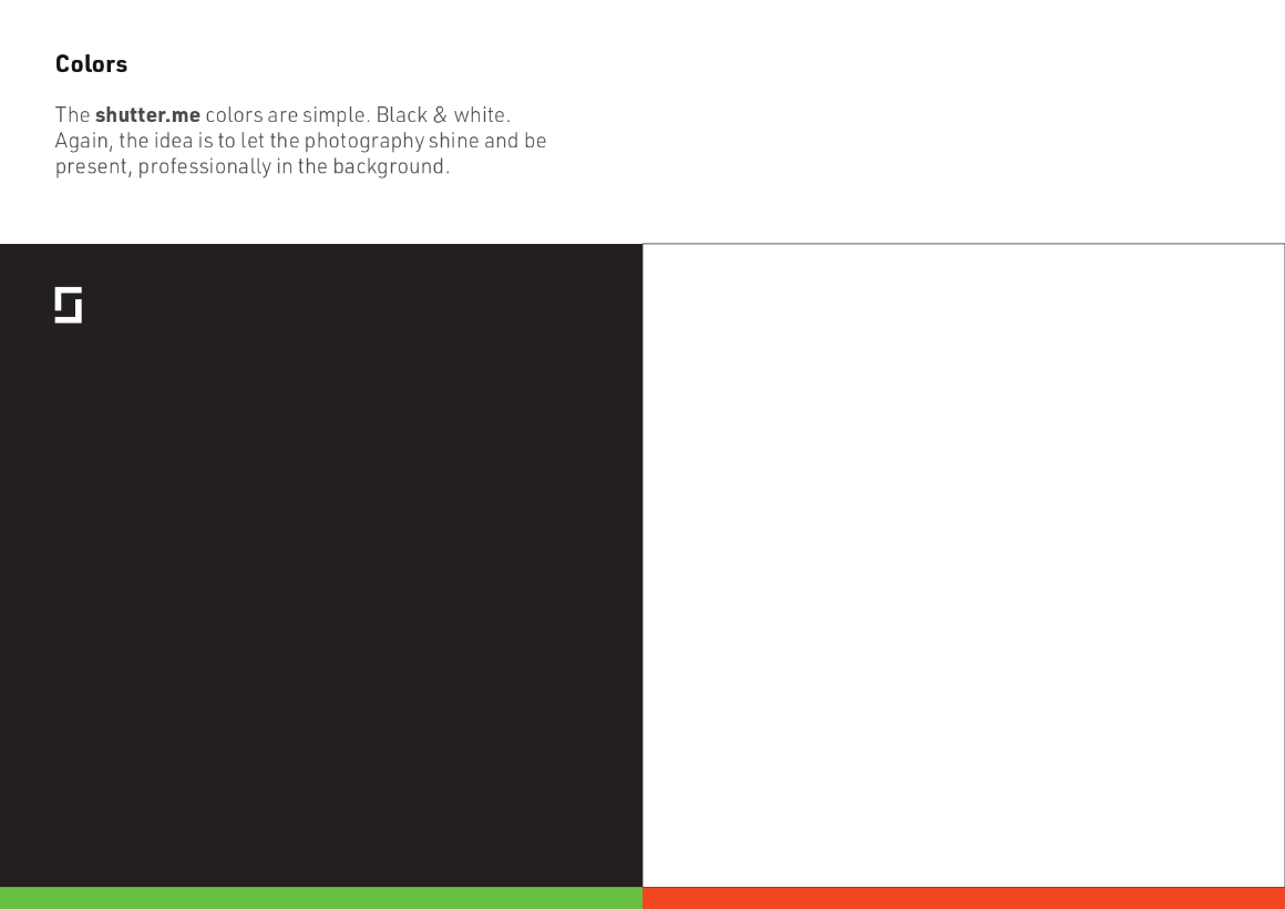
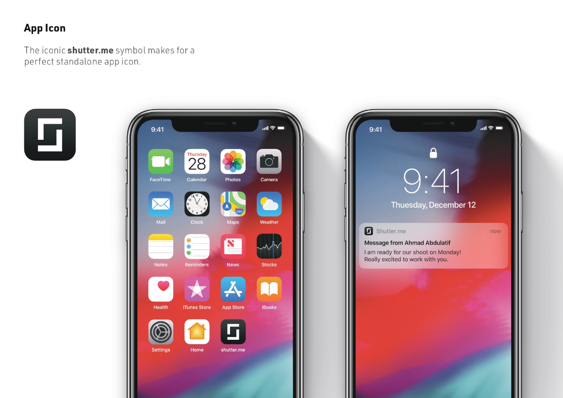
Now we are ready for the User interface design, based on a design system tailored to match the branding and the functionality needed to make target users’ lives easier.
We started user interface design after establishing a strong design system based on the wireframes, using the brand guidelines as a reference and the research as a direction.
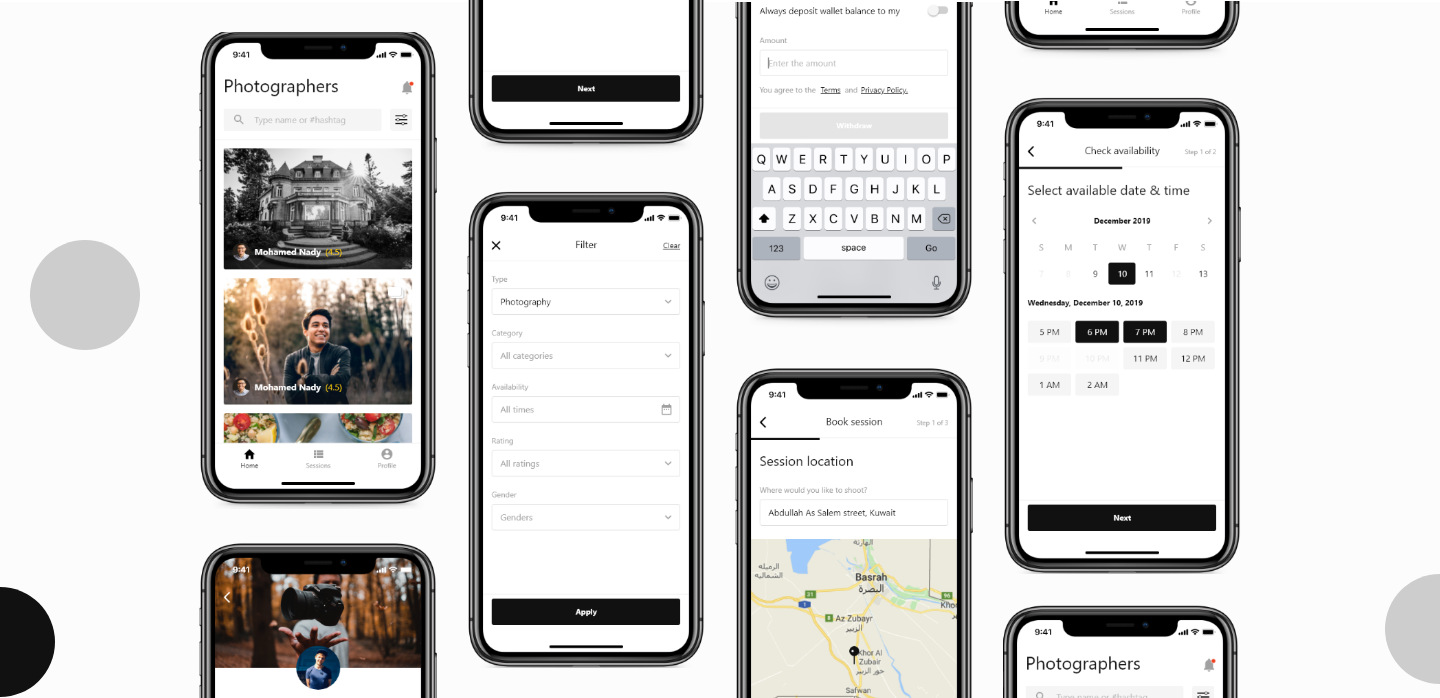
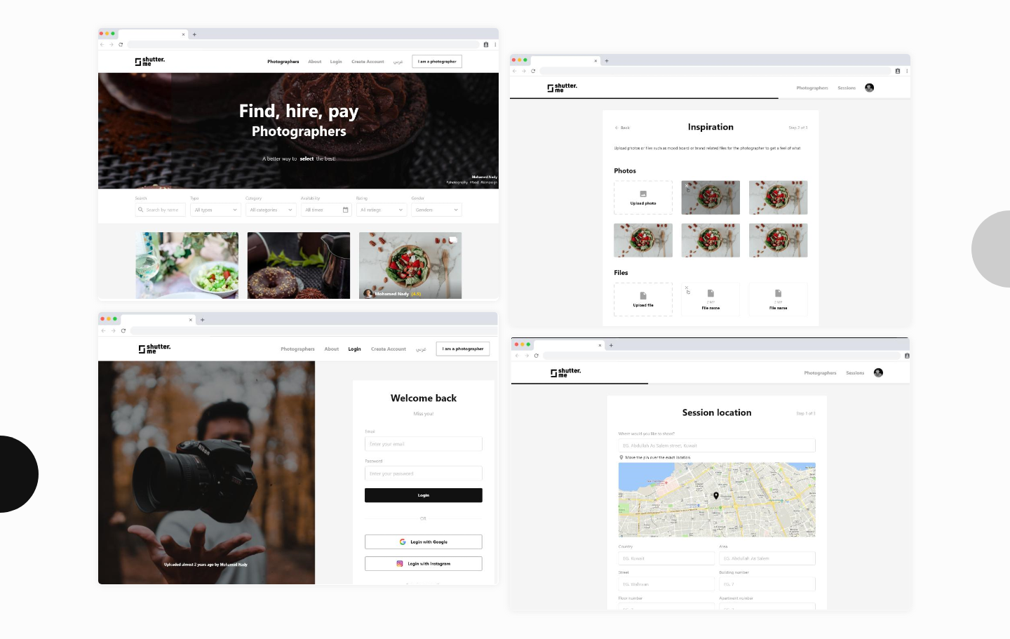
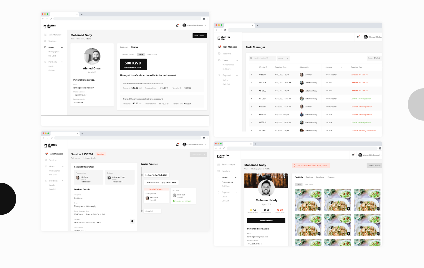
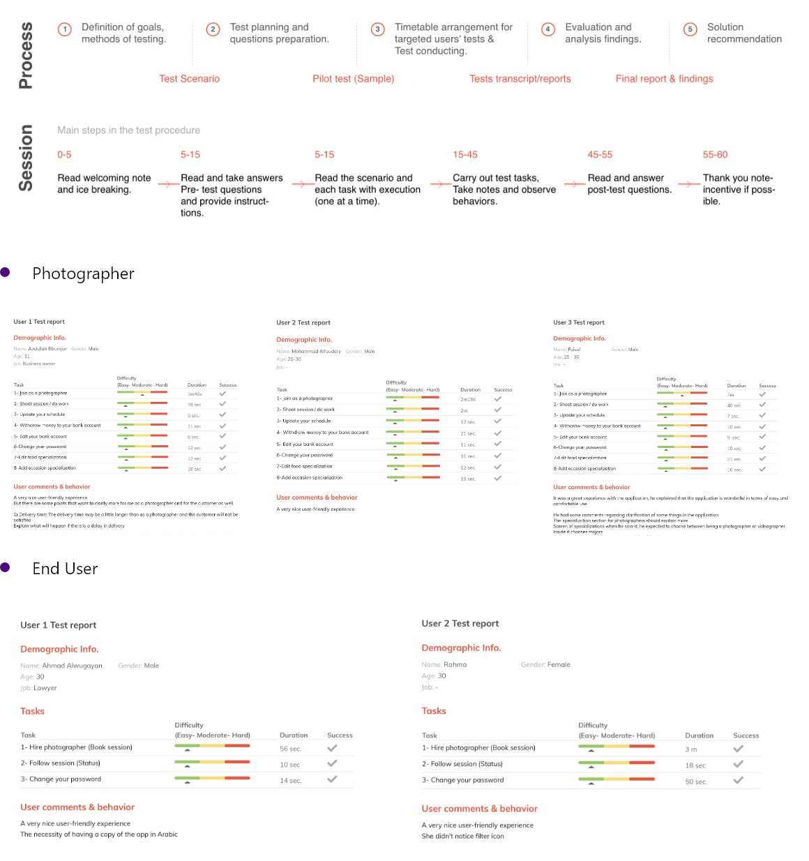
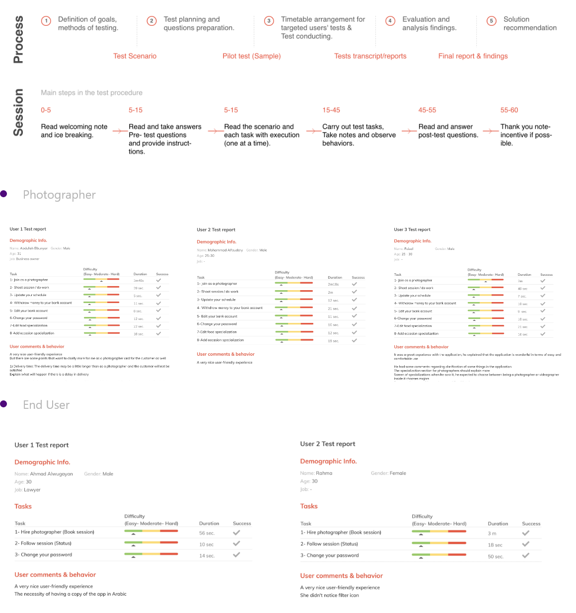
We conducted user testing on ” Prototyped User interface ” that has the real feeling of our product, we got the most valuable feedback that has been used to understand our users even more and refine our product to fit their needs, as we believe that
” Great design is iteration of good design ”
We conducted user testing at the early stages of our product on wireframes to get early feedback from our users, and it resulted in valuable feedback from our users, We also conducted user testing on ” Prototyped User interface ” that has the real feeling of our product, as we believe that ” Great design is iteration of good design ”
Interested To Partner With Us?
LET’S GET STARTED