UX Strategy has been a part of a UX/Product Designer responsibilities since forever, but it’s often got forgotten, as usually more attention gets drawn to the craft part vs the decision making part of UX, unfortunately usually clients/managers are eager to see fast results than more profound results achieving results, that’s why usually UX Designers focus on the craft part (IxD/UI) than the defining/ideation or research/strategy part.
So why UX Strategy is important:
Ofcourse alot like to classify the Strategy part as the link between UX and the business objectives and the research part as the link between UX and user needs, I’d like to think of UX Strategy as the umbrella over both, it’s understanding three main aspects, Business, Users, Market.
To understand those three aspects we go through many activities/methods like stackholder interviewing, user interviewing, surveys, competitors research etc.. then we start modeling in many canvases like bizz/creative strategy, value proposition canvas, strategy canvas, personas, empathy maps, user scenarios, customer journey maps and lots more.
For those UX Designers who are professional enough to work on UX Strategy before digging deeper into IxD I’ve noticed a problem that we often go through, as the activities and canvases are alot we often lose track and start working on our designs detached from the strategy we’ve researched earlier.
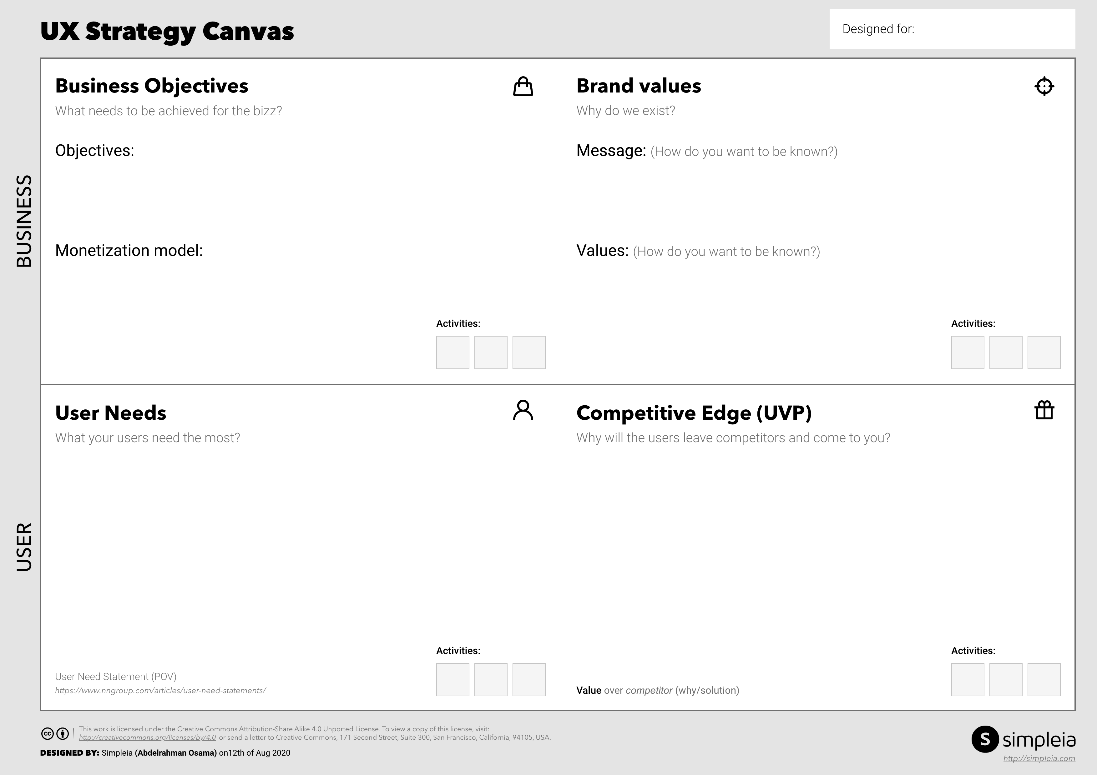
As a solution to this problem I’m proposing the “UX Strategy Canvas” it’s gathering all key takeaways of the whole UX Strategy in one canvas that makes it easy for designers to stay focused and keep track of it while in the design phase.
Before I show you the canvas, there’s one more thing we’ve missed out, one very important aspect, anybody can guess ??
It’s BRANDING, it’s really important to connect the business objectives to the design process in order to make a design that achieves the needed business objectives, it’s equally important as well to connect the brand message and values to the design as well, designing a product that doesn’t fit the brand values or not consistent with it is a disaster.
So here it is:

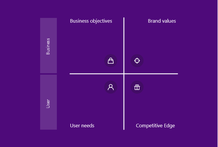
So the point is to deeply and briefly define each of these 4 aspects:
Each one of them answers a very important fundamental question.
Firstly the BUSINESS section:
Q1: What needs to be achieved for the business?
Business objectives:
First, we need to address the most important objectives like more orders, more subscriptions etc… nothing fancy just the direct goal of the business.
Then I tried to make it a bit more clear by defining the monetization model, as I often see people wrongly addressing business objectives to customer needs instead of business needs, so I thought writing down the monetization model for non-NGO’s ofcourse would be of a huge benefit.
Q2: Why do we exist?
Brand values:
Firstly the message (How do you want to be known?)
Secondly the brand values (what you stand for what you believe in?)
We often find products with not so well defined brand strategy but maybe that’s one of the benefits of this canvas, to show us the gaps that need to be filled, a product without a strong brand (not talking about the logo and identity ofcourse) is not likely to succeed in today’s world.
Secondly the USERS section:
Q3: What your users want the most?
Ofcourse there might be alot of needs (Jobs, Pains, Gains) for the users but here we just need to address the most important.
I didn’t find a better statement to define it very well more than the User needs statement very well explained by NNGroup
Q4: Why will the users leave competitors and come to you?
Competitive edge or Unique Value Proposition
And for that, I proposed a specific format:
Value over competitor (why/solution)
e.g. Easier to book than Uber (book one time scheduled trip)
That’s all for the sections, but after I finished thinking about this canvas and reviewing it with the glorious Simpleia team I was afraid that designers would use it wrongly like other canvases by putting it there then start filling it, out of assumptions without making the effort.
That’s why at the edge of each box I added a place to add the activities made in order to come up with these conclusions.
For example:
Business objectives: Stakeholder interviewing
Brand values: Brand strategy
User needs: Value Proposition Design, User Research
Competitive Edge: Strategy Canvas, Competitor Analysis
So the thing is, this is the a summarization of all activities/efforts made through the Research & Strategy phases not an activity on it's own, it's just putting the summary of each of the sections all together in order to get it all defined in one place.
So it’s basically useless without making the activities itself first, that’s why it’s important to fill up the activities part as well with the actual activities done in order to come up with the canvas content.
One more tip, always use end goals, for example in business objectives e.g. don’t use “Improve conversion rates” instead write “make more orders/accounts etc..”
I hope this is useful you’re welcome to download the canvas below, the example canvas is filled with Hive’s data the other is empty for your use.
UX Strategy Canvas Hive-ExampleUX Strategy Canvas empty


