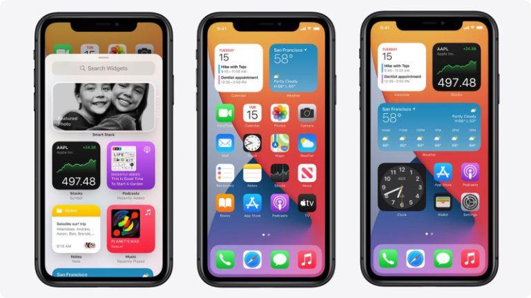
Gathering features, speaking of advantages. Apple is welcoming the new version of widgets. Generally speaking, widgets aren’t new. A widget is a summarized version of the app, gathering all needed info about the application whether the weather of the city you live in, type of music you listen to or even your schedule calendar finding them all in your home screen and more.
iOS 14 widgets glimpse
iOS 14 widgets offers contextual info about the app with a fairly limited scope. Apple says about their newest version of widgets: “The information your widget chooses to surface can be more up to date and contextual than ever and drag and drop editing gives people direct control over their widgets in an intuitive and flexible way”.
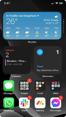
Apple new widgets are applicable with system apps such as calendar , clock , files , fitness, also some apple utilities are compatible such as batteries, screen time and of course Siri suggestions, finally it’s applicable with some sort of third-party apps but still in beta.
The difference between iOS and android widgets
Although Android was the first to introduce widgets back in 2008, Apple played a fair game and introduced a well thought and designed widgets, as they rarely does something just because everyone else is. So what is the difference between iOS and android widgets?
We made a simple comparison in the table below for designers as a guide to know what to expect when designing for each:
Widgets


Size
- Three uniform sizes:Small, medium and large.
- Customizable sizes (to your preference).
Functionality
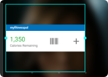
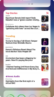
- Data display mainly and some targets to a specific page inside the app (no actions).
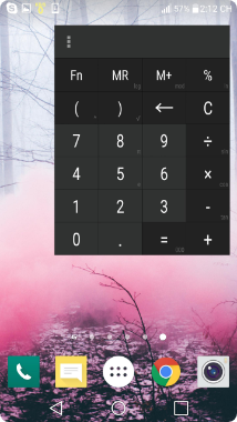
- Some widgets offer instant functionality like phone brightness or calculators.
Download customized widgets
- Available in system and third party apps to customize.
- Many ready made widgets are available individually at the play store.
Third party apps
- Available.
- Available.
Special features
- Smart stack widgets show and can customize widgets (iOS system).
- Widgets show during the day according to your daily activity (by using AI).
- Creating your own widgets (customized widgets).
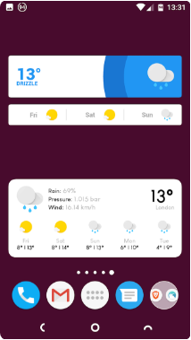
Search
- Groups in alphabetical order and placing the most used applications on top.
- Groups showing number of widgets with a voice search.
Designing for iOS 14 widgets
We will now go deeper in iOS 14 widget design. There is no secret recipe for designing great iOS widgets, but there are some guidelines that will help you as a designer to understand Apple’s perception about widgets.
Apple revealed their guidelines for iOS 14 in both their website and WWDC latest conference. When designing widgets in general, you should focus on two things:
1- Ideation (The widget’s main idea and what to design).
2- Creation (How to implement).
In the ideation phase you should focus on:
A- Principles
You should understand the experiences that make people return to your app, you can look for things that are:
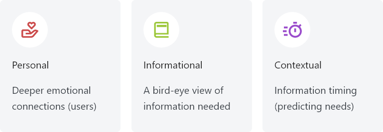
B- Editing:
You should think about the widget structure and how it will be edited in different sizes, as it might change the way you think when making different widgets with different scopes & information.
For example:
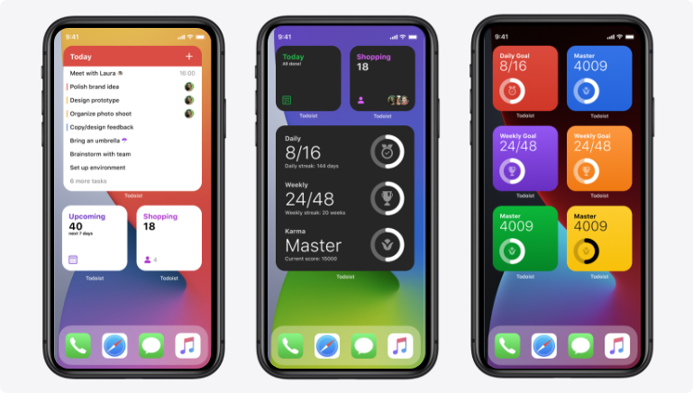
In the todolist app you can add a task or more to display in various amount of widgets, in other words, you can add as much as widgets you need with different information the way you want it to appear (a flexible approach see pic. below).
C- Multiples:
You should think about different sizes, should you offer different widget sizes or not? That should depend on your content.
In the creation phase, here is some points to take in consideration:
A- Sizes and interactions:
For the size part and as known for us now that the system supports three sizes, you may think about the following:
- For small widgets: with 4 icons size, it should accommodate the most useful pieces of information, as it will have a single target to the app, so it will depend on how your app is structured.
- For medium and large widgets: with 8 and 16 icons size, they should support more tap targets (2- 3max), and can hold more information.
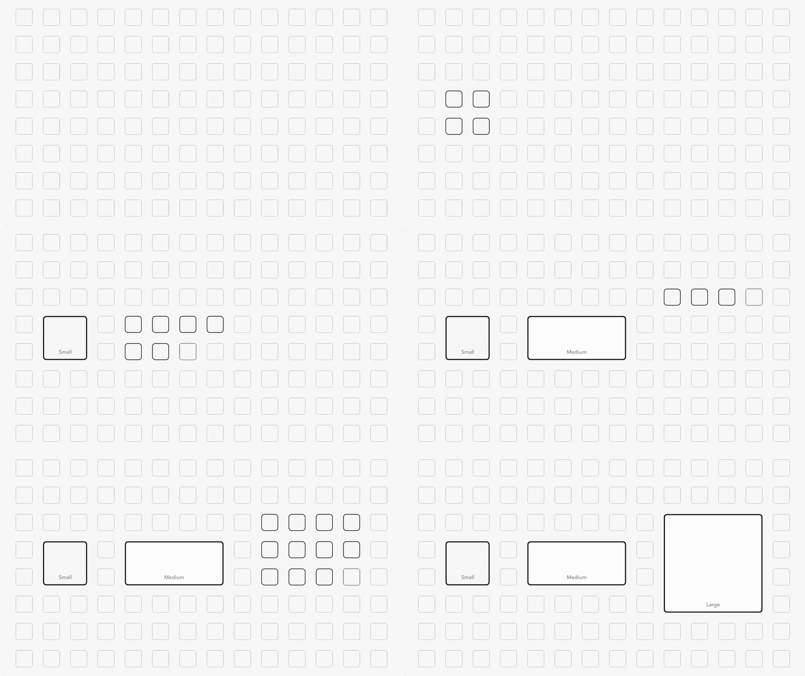
- For layout & interactions, Apple suggests three design styles for widgets:
1-Fill style: if you support one tap target.
2-Cell style: if you have many pieces of icons constrained in custom sizes
3-Content style: if you design unconstrained information.
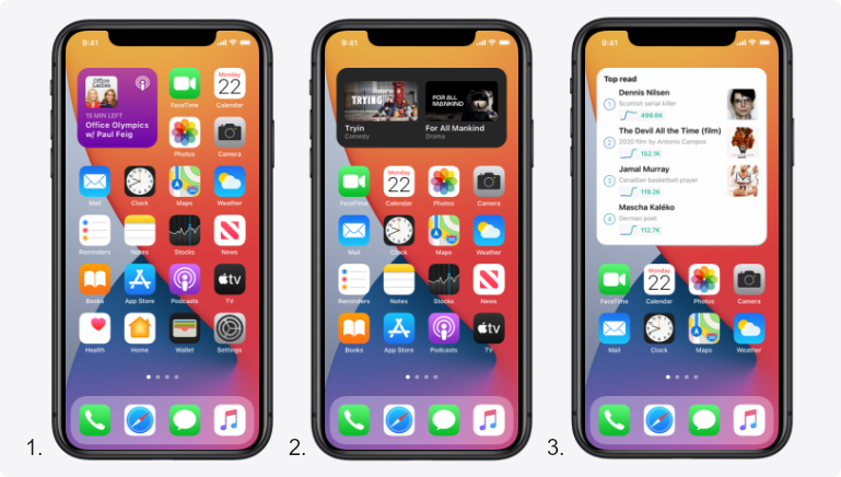
And there are some general tips like:
- Use a design style that reflects the app feel and look (simple look, iconography, etc.).
- Take inspiration from your app icon like the note app, the purple gradient background in the podcast app.
B- Laying out content:
- For organizing your widgets you can use on of these two patterns:
1- Expanding across all sizes to add more information (more info means larger size).
2- Using unique styles for every size by prioritizing the most important info and keep in mind that widgets aren’t scalable as you should think through every size.
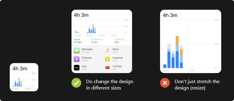
C- Patterns
There are some of the most used patterns made for small, medium and large as the following illustrations:

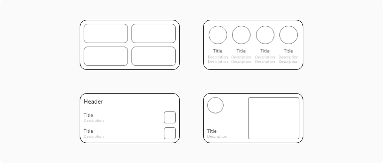
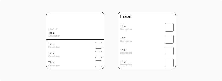
Additional general tips:
- Avoid showing the app logo, or icon in your widget: The exception is when you want to display presented content from multiple sources.
- Use color wisely: Rich colors will be attractive but it should’t abstract the user from reading the widget content in a glance.
- Support Dark Mode: by offering both normal and dark backgrounds.
- Consider using SF Pro font: to make the widget feel consistent with other widgets and icons in the home screen. If you insist on using a custom font, just make sure it is accessible in reading.
Which apps should need widgets?
So after all what have been said, which apps we should design widgets for? As a short answer: For almost all apps, you can design a widget, but keep in mind this simple rule “if it didn’t add value to your app, don’t make it”.
The list can be countless from e-commerce, food delivery, social media , travel and booking, stocks, fitness, learning to gaming and entertainment apps.
It might be tricky some times to design a widget, for example in banking apps, it can be hard to display content related to sensitive data like transactions and balance, also in other apps that need log in sessions, it will be hard to show updated information all the time.
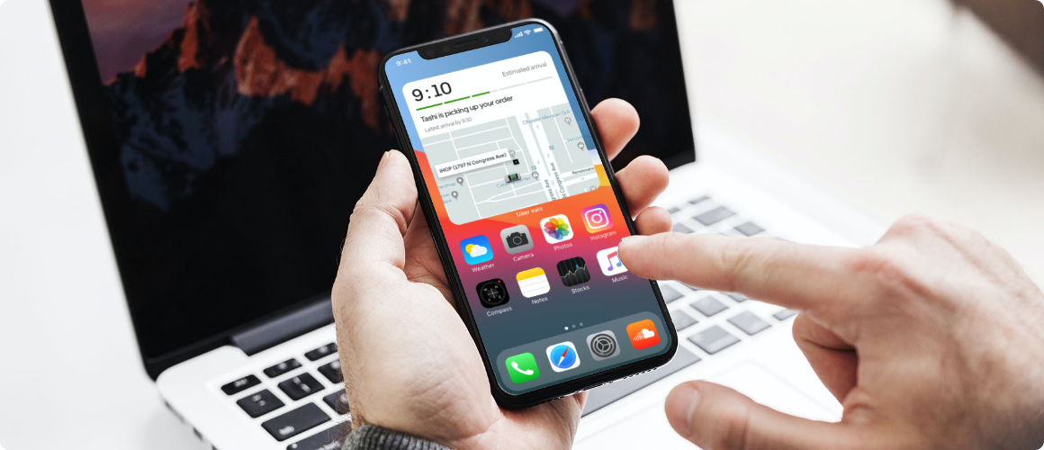
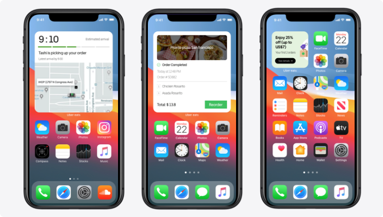
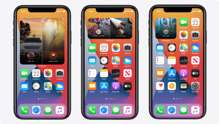
Here at Simpleia, we unofficially designed two sets of widgets for both Uber eats and Instagram to explore possible opportunities for such apps, and as shown below we focused on some important flows like (repeating and tracking orders for Uber eats and navigating updated and important stories in instagram).
Takeaways
- For every designer It never can be said what’s the best practice for a widget but it’s always useful to read updated news , articles for more insights .
- Gathering the important information of some application in a little widget will minimize the time hassle and the background working of the apps like just knowing today weather or a world clock in another country by opening your home page.
- Some affordable examples may include your payment mobile bills apps to remind you of your bills or how much it will cost without opening the app.
- Start thinking about each time you design an application and how you will benefit from.
At the end here is a great reference video to watch for more explanation.
Design great widgets WWDC2020


